Thursday, December 15, 2011

final projects are in....

Hey  peeps, finals are over and done for! I now get to be lazy without any regrets. The other day one of the kids in my class told me how she had someone approach her while she was sketching. So you all know, sketching is a big part of our grade. Anyway, this person just raved about how cool it was that she HAD to do something fun for her grade. It's so funny how misleading art can be. No it's not easy. No it's not fun when you're getting graded for it. It's probably the most stressful thing ever, but I sure do love it.

Well, here are some of my finals from this semester. Check 'em.

Intro. to Illustration.

So a most exciting event is taking place in the printmaking room! The Fall 2011 Print Exchange. The concept: Elephant in the Room.

It was such a fun exchange with great prints! This is the last exchange for Matt, Beka, and Kim. So it was all bitter sweet. 


Another great event that took place is the student print sale. I sold and traded a great deal of prints to my pals, but the sale didn't do so great because not many non-artist don't find joy in these kind of things. But hey, I got to take home like 8 prints including a salt and pepper shaker and a bowl i bought at the Student ceramics sale. I just couldn't help myself...plus I'm a big advocate of supporting student work.


Sunday, December 11, 2011

final project...

Can you believe it's the end of the semester already?! I feel like I'm just getting started, but at the same time I'm exhausted and ready for a break. For our last assignment in Digital Illustration, the class brainstormed and came up with several concepts. Some of which were:

1. What could possibly go wrong
2. Arduous journey
3. Nothing gold can stay
4. Watch this!
5.  and others....

I'll be doing a piece on "Arduous Journey." Here's a sketch.


Hopefully you can tell what's going on. Hopefully you can tell that I didn't have enough time to work on this thing. Anyway, this journey is about how difficult it is letting someone go. Well peace out.

Tuesday, December 6, 2011

BFA...

I thought I should post this exciting news. So I applied for the Bachelor of Fine Arts program for Illustration this November. I'd like to announce that I made it into the BFA program. I am super excited. I never thought it would happen, but here I am joining the elite group of BFA. Speaking of BFA, BYU-Idaho just had their BFA show this semester. Here's some illustrations and us at a friend's show.

Monday, December 5, 2011

it's midnight...

and I'm ready to catch some Z's. Speaking of sleep, (drum rolls please) I finished my sleep disorder piece. I am quite proud of myself for finishing it a day before it's due. Now, I should have plenty of time to print and mount it and get to class on time on Wednesday. Right, I'll probably forget to print it, and I'll have to print it last minute like I always do, then I'll be late to class like I always am. Anyway, check it out!


So this piece is sort of a self-portrait. Nah, it is a self-portrait. I got the idea for this piece because I'm the kid always falling asleep in class. Thought it'd be a funny narrative for the concept.

sleep sleep sleep....

Here's what I have so far for my sleep disorder piece. Check it.


Wednesday, November 30, 2011

fixer upper...

I made some changes to my Santa. Burr didn't like the teeth, so I just had to fix them. It bugged me that he didn't like the teeth so I became obsessed with fixing it. Check em out.

santa 1

santa 2

Let me know what you think so I can finally print this sucker. Thanks much peeps. 

cant' sleep....

Next assignment for digital illustration, sleep depravation. We're to do a serious or a humorous piece about how people have trouble sleeping. Here's a little sketch of what I might possibly do. I got this idea from, well, my class. A couple of us (including me) have a hard time staying awake in this 8-o-clock class. So the piece is just going to show a classroom full of sleeping students. Fun? Yes? Let me know what you think...pretty please.

Sunday, November 27, 2011

happy man...

I fixed my Santa, and I've very pleased with it. I stuck with the idea of a Santa who's teeth were rotten out from all the cookies he had eaten throughout the years and applied that gross/grungy look throughout the piece. Oh, check out that line work! I love the new brush I created just for this piece. Anyway, check it out and let me know what you think!

Tuesday, November 22, 2011

band poster...

For our next project in Intro to Illustration we had to do an illustrative advertisement. I chose to do a band poster for The Avett Brother's New Year's Eve concert. I decided to be ambitious and do a block print...with three different colors. Yeah, three blocks. Did I mention that this was my first time doing a block print? Yup, ambitious. So here's the process...


Finished blocks. 


Matt being helpful.


So if you can see from the photos, I had some trouble with the ink. How did I fix it? Well, at first I decided to paint it. Since it was Sunday night and I didn't have access to my locker which had my paints and brushes, I had to wait till today. Long story short, I started painting it at 7 am. Had to go to class at 8, decided to do it digital, but then a friend told me to just paint it because doing it digital would lose the aesthetic. So I painted and inked it...volia!


Saturday, November 19, 2011

the happiest man in the world....

Merry christmas folks! Yes, I'm getting started early just like Wal*Mart and the rest of the commercialized world. Our next project is, if you haven't figured it out yet, is a Christmas piece with the concept, "The Happiest Man In the World." Here's what I have so far....


Critiques please! Thanks much.

Sunday, November 13, 2011

i ventured...

So this assignment was particularly difficult for me. Let's just say I had creativity block. I changed my concept, but I feel like I didn't really portray it to the best of my abilities. The new concept is breaking down the walls that keep you from moving forward. Check it.


See what I mean. It feels kind of elementary. Let me know what I can do better. Suggestions please! Peace out.

Wednesday, November 9, 2011

new stalkee....

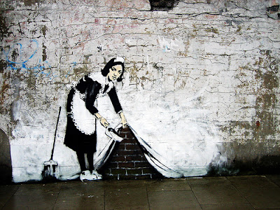
Guess who I've been stalking! Banksy! When I was a junior in high school, my art teacher, after looking at my sketch book, asked me if I was going to be a tagger. I said no. Well Mrs. Jenkins, I just might be after all! Banksy is just amazing. Check his work out!


My cool friends introduced me to this British street/graffiti artist. This guy is legit peeps. His work is being preserved, like putting plexi glass over his graffiti. When in San Francisco, we looked all over China Town for one of his works. We found it, but it didn't look like this...


It looks like this. Yup, disappointing right? How dare someone try to upstage Banksy. What a shame. But I'm glad we I got to see it. If I had known him earlier, I would've looked for his stuff in London. Anyway, hope this gets you inspired, cause I am. Peace out.

Tuesday, November 8, 2011

nothing ventured, nothing gained...

Boy do I have some catching up to do. I was in San Francisco last week for travel studies. Oh man was it amazing! We went to the Crocker Museum in Sacramento, the SFMOMA, De Young, and the Legion of Honor. Well, the amazing-ness came to a halt and reality came back into my life. Now I have much to make up. Upon my return, I stumbled upon the "Nothing Ventured, Nothing Gained" assignment for digital illustration. Here are some sketches I have so far.

 This is what I have so far. My concept is a narrative about me. Remember how everyone is onto me about being Picasso and being all adventurous with my style? Yup, this is what this fancy piece is about; my dilemma about being who I want to be and what others expect of me.


Oh by the way, I fixed my portrait. I fixed the color and texture that indicated shadow under my nose. I also added another orange shape that I forgot in between my head and pony tail. Check it.

Sunday, October 30, 2011

midterms...

It's midterms and we're getting into the narrative assignments of the assignment. So to start of the narrative assignments, we have to do a self portrait, caricature style! Check it!

Thursday, October 27, 2011

book cover...

The second assignment for Intro to Illustration was to do a book cover. Wanting to try my hand at fashion illustration, I chose a book that would fit that style, Invisible Monsters by Chuck Palanhuik. For two weeks I did thumbnails for my concept, but nothing was working. A week before my finale project I threw all those crappy ideas and came up with a totally different concept. CHECK it!

original: water color, paper, and graphic pen

edited in Photoshop and type added in InDesign

Awesome huh? I'm pretty happy about it. If you didn't notice, I forgot the "I" in between the "V" and the "S" in the original. I didn't realize this until AFTER I had carefully cut out the letters from the tissue paper. Luckily, Photoshop was there to save the day. Anyway, let me know what you think and whether I should stick with the Helvetica or change it to Fuetura. Thanks much!

Wednesday, October 26, 2011

picasso girl...

Did I not tell you that my first piece, the master copy of Picasso's Don Quixote, would haunt me for the rest of my life? Well it's starting, and no one is going to let it go. Critique went well for my arbitrary piece. Burr loved the colors, but (that's a big but) he expected me to go all Picasso on it. "What happened to Picasso, Picasso girl?!" he asked me. Burr wasn't the only one asking about my Picasso inspired style, several students were as well. "Embrace it!" "Delve into it!" and all that fancy crap. For the record, Burr isn't asking me to be Picasso by doing all my work in his style. He expects me to be adventurist with texture and line....adventurist with my style. So let's be adventurist. Let's be inspired and create cause that's what I'll be doing from here on out....Picasso style.

Sunday, October 23, 2011

arbitrary color...

Pretty self explanatory right? Our next assignment for digital illustration was to simply find a photo, change the color, saturation, contrast, etc. so that there is no trace of the original color. Then we're to render the photo in its new color digitally. Check it!


    original photo. of course i had to do fashion. then colors edited in photoshop.


finished product. 

fashion obsessed...

Hello my peeps. Good news, I found another artist to obsess over. AND she's a fashion illustrator! Introducing Stina Persson, fashion illustrator extraordinaire! 


She works with watercolor, acrylic, ink, and paper. She's sooo fun! I'm obsessed with her style because I'm in love with line, color, shape, and texture. She's simply an illustrator genius. So check out her website, be inspired and create...cause I am. In fact, she's my inspiration for my upcoming illustration project...creating a book cover. So watch out for that sucka! Peace.

Saturday, October 15, 2011

Book Arts...

I've failed to post about my other classes. So this post is just to update you folks on what I've been up to in good ole book arts. Book arts is not a craft (aka arts and craft). In this class we learn the traditional techniques of book binding. We use materials that are archival, also known as expensive paper that will out live you. So far in the semester, we've been learning the different types of bindings. At the end of the semester we'll have to create a book with content. Like, for realz content; no journals, no photo albums....but artistic concepts. Aside from that, here's a book I'm currently working on.

Isn't that paper just fun! This one's just a mock up, but on Friday, I worked for five hours just tearing paper and getting my final book ready for Tuesday's class. 


Look at all that lovely paper. Seriously, I could tear paper forever. It's so relaxing.


My lovely work space. Check out the half eaten hot pock. I forgot to eat lunch that day and all I had was a lame sauce hot pocket. Oh, and let's not forget how messy I am and, oh the fact that I shouldn't be eating whilst I work. Bad habit.


Voila! Book is ready to be sewn in.

what a wonder...

Yes, I'm amazed with the results of my second master copy. On Wednesday, we learned the mixer brush tool and I loooovvvee it! I had a blast painting this piece. So I chose to copy Anne Faith Nicholls's oil painting, "Small Wonder: Blue Heart." I chose a simple painting, but like always, they're never simple enough. So check out the results and let me know what you think!

Wednesday, October 12, 2011

first attempts...

My first attempt at fashion illustration for a class assignment went really well. Brother Burr loved my piece, and I was quite surprised. My piece was just sooo different from everyone else, but that's probably a good thing. I was just  worried I didn't go far enough, that I wasn't brave enough to take on the new tools and techniques. But this first attempt turned out to be a piece that Burr loves. Here are some changes I made...not much but they're there.


Monday, October 10, 2011

master copy 2

Yes, another master copy. But first, we must have an artist and the selected piece approved. I'm having quite a hard time because I'm obsessed with two artist right now, Graham Franciose and Anne Faith Nicholls. I'm looking for a piece with a lot of neat-o texture, preferably easy to do digitally, but fun and interesting to look at. Here are a couple I'm debating between.

anne faith nicholls


graham franciose

So help me pick a piece, pretty please?!?! Or let me know if there a different and better piece I can do. Peace out peeps.

Sunday, October 9, 2011

cruela da vil + yzma

 Our third digital drawing assignment was to play around with texture. I wasn't sure if I would enjoy this assignment, which is weird because I looove texture, but the whole layers modes and actions thing was not floatin my boat.

With that aside, in creative perspective, we have to create a villain's lair for our next assignment. Along with our lair, we can either create a villain or choose an already existing villain. I've been working on some sketches for my villain; a fashion villain, because I love fashion and cruel de vil happens to be my favorite villain. So I've been using cruel and yzma as references.


Now back to digital! Because I've been doing nothing but sketching my fashionista villain, I happen to use my villain for my texture project. This is perfect because fashion and texture are just perfect for each other. I had a Ba-LAST working on this image. Cha-cha check it out my peeps!

Wednesday, October 5, 2011

change is good....

I made some slight changes to my pumpkin. I'm actually sitting in digital illustration right now. Anyway, before Burr gets to my piece, check out the changes. 


Much better huh? I changed the texture of the shadow on the pumpkin, so the texture of the pumpkin and the shadow are in better harmony. The last shadow texture, just flattened the pumpkins texture.

So before Burr critiques my piece, let me tell you of the crazy morning I had printing&mounting my piece. I get to the CopySpot in plenty of time to print my piece, but what always happens when you finish things the day they're due....everything decides to go wrong. So the printer had problems, so I had to resend my image. Then it printed, FINALLY! Then I take my lovely print (holding it by the white border) up to the Media Lab to mount my piece to foam core. Before I tell you this part, please think of good&polite ways to tell people to leave me alone, I can handle this. When I get to the lab, I ask for foam core, a ruler, and an exacto knife. Then the lady decides she wants to be helpful and tells me that cutting from the giant cutter (which I refuse to use because I don't trust them) would save me time. I tell her nicely that I don't use that and I'm fine using the knife&ruler. BUT she takes my piece and decides to teach me how to use this giant mat cutter. At this point I have 10 minutes before class starts. I had to forcefully tell her ok I got it, because she wouldn't take her hands of my piece (which some of the ink smeared because it was still wet....dang CopySpot and the luster paper they use).  So I get my piece back into my safe hands, but the girl wouldn't leave me alone. She kept talking to me, and I'm like, "Look you're nice&all but leave me alone." Oh, and just like I expected, the giant cutter didn't save me time, and I ended up having to cut it with my knife because the cutter didn't cut all the way through. Lame sauce.

Now I'm in class and at peace, because Burr likes my piece. Loves the texture of both the pumpkin and the background, but he says they don't harmonize. Oh, and after critique, he's not too happy with CopySpot. He says they should be shut down from bad printing. Yup, I wasn't the only student who had trouble this morning.

Sunday, October 2, 2011

let's get in the spirit....

of Halloween! I love Halloween so in great fun, our third assignment was to paint a pumpkin with a lot of texture, otherwise known as imposto. I enjoyed this assignment better than painting the apple because painting texture is my thing. It did get a bit tedious, but other than that I enjoyed it. Check out the results!


So I tried painting a face on this pumpkin, but it just wasn't looking right. Probably the problem is the angle of the pumpkin and I was just drawing the face in the wrong perspective. Anyway, let me know what you think. Face or no face?!?! Thanks so so much peeps!

Wednesday, September 28, 2011

critique times 2

Today is a good day for critiques. I have the final critique in digital illustration for my apple rendering that i'm suppose to fix. Here's the fixer upper.


Brother Burr likes that the worms are gone, but just like I predicted, he expects more from me because of the Picasso sketch I did for my first assignment. So he was bored with this painting. No worries, my ego isn't scared. I totally get it. Burr said I need to be more creative and expressive. Pretty much, he's telling me I need to have fun with my art and be more like Picasso. I'll admit, I didn't have as much fun doing the apple rendering like I did the Picasso sketch. So that's saying something.

Second, I have a critique on my master copy in intro to illustration. For that assignment we were suppose to copy an illustrator's work. I chose Gustav Klimt's Judith I. First we were to do a line drawing, then do the painting. The results? Two long nights of painting (because I started late) and patience. The results. Let me know what you think! Thanks peeps.